One of the primary concerns when creating a website is how it will influence a marketing campaign, as it largely determines public perception and can make a significant difference in the success or failure of the proyecto.
Take a new product launch as an example. It is not enough for the product to be good; communicating its value functionally and creatively is also key. This is where a modern website becomes a strategic asset, capable of capturing attention, generating interest, and, above all, converting high-quality leads into customers.
What I want to talk to you about today is precisely that: how a website with a creative and well-executed approach can become a powerful driver for any campaign. From visual design to user experience (UX), every detail can influence public perception and, consequently, the results obtained.
Now let’s consider how people might react to visually striking or unconventional proposals. A website that manages to stand out for its originality is not only more memorable but also generates conversation and strengthens brand identity.
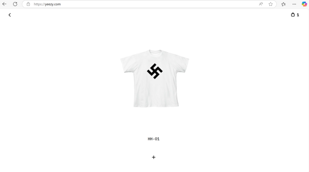
A recent, albeit somewhat controversial, case is that of Kanye West’s store (or rather, the former yeezy.com store). The site was completely transformed to display a single product (and what a product it was), which generated a wave of negative reactions, comments, and impressions. While perception in this case was mostly negative, the media impact was undeniable. This example leaves us with an important lesson: decisions made on a website can positively or negatively amplify the reach of a campaign.
Screenshot of the yeezy.com website
Now, setting aside this negative example, vamos with the topics we like most at Driza (leads, traffic attraction, conversions, etc.) to see how a campaign would be positively affected by its website. To do this, vamos to talk about three types of websites we commonly encounter:
Product launch or presentation
Immersive
Modern
Launch or product presentation websites
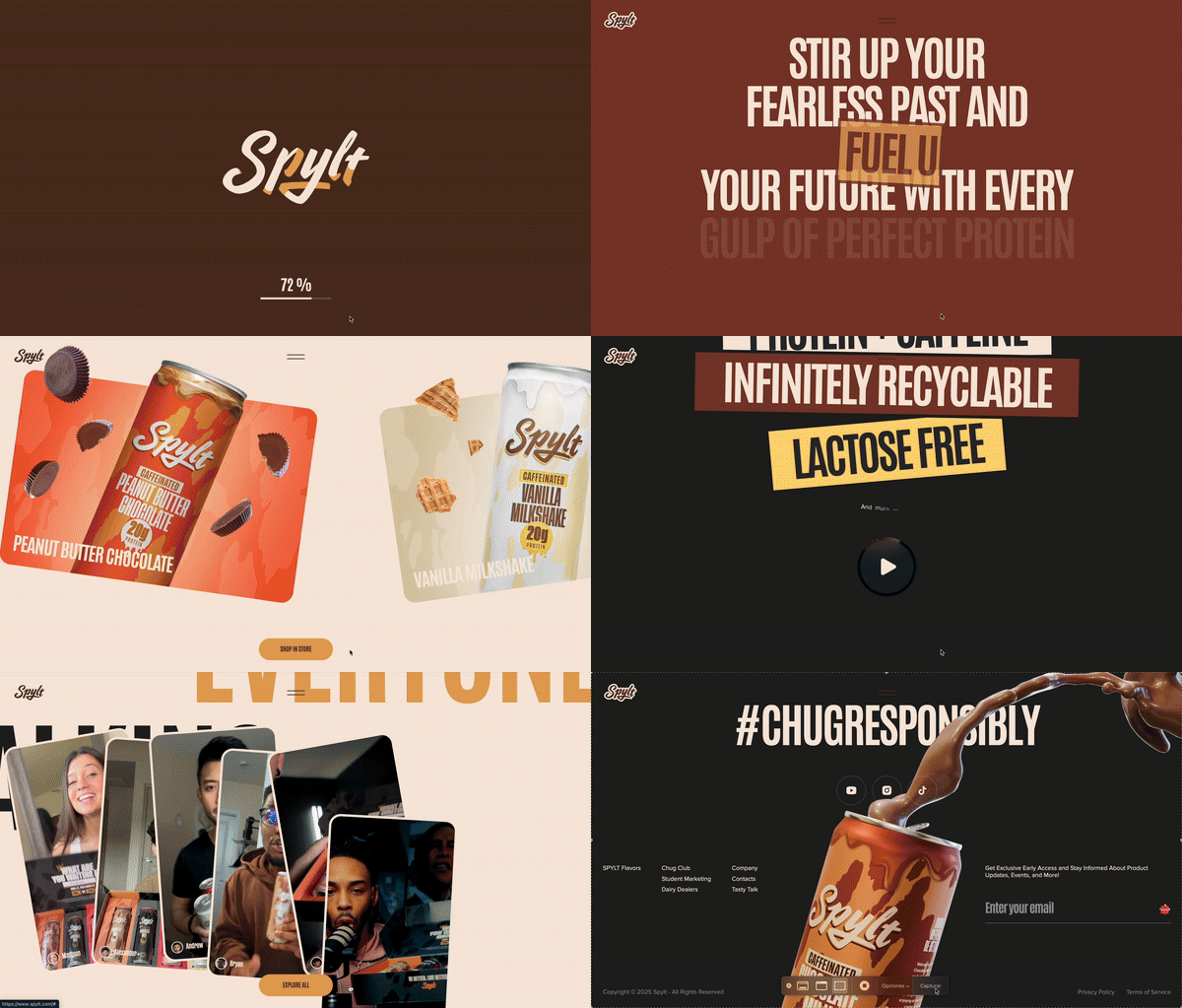
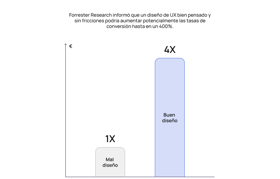
These proyectos often feel like a commercial because they try to show you everything the product does with videos full of effects, infographics, and various sections that ensure you understand the product in its entirety. An attractive and functional web design for a product launch can increase the conversion rate and improve the user experience by more than 400%.
Spylt
Now, the important thing when we talk about campaigns and their effectiveness: how can this be reflected in numbers?
For example, the “Call from Santa Claus (2014)” campaign for Coca-Cola, developed by Asombro Extremo, offered children a personalized video where Santa Claus greeted them by name. This unique and creative experience resulted in 4.5 million calls in one week and received 35 awards in international advertising competitions.
We can observe a notable increase in the generated metrics, not only in terms of quantity but also in quality, which is most important. In this campaign, we can see how marketing can move people positively and create memories.
Several things can be highlighted in this campaign:
Coca-Cola gained brand presence by generating great interaction and public attraction.
Millions of unforgettable connections were created for these children, who are now adults and will still remember it.
Asombro Extremo received international recognition with various awards highlighting their effort and, above all, their creativity when planning this campaign.
In this way, we can realize that a launch or product presentation website can generate a great impact and attract an audience; it doesn’t necessarily have to have a “WOW!” effect, but rather be well-thought-out for its target audience and how they interact with it.
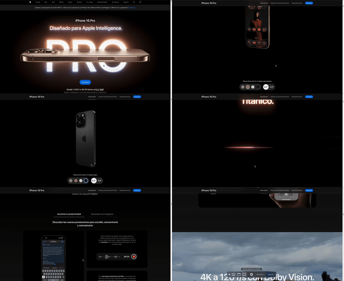
We can find this type of website quite often for tangible products, as is the case with Apple, which always stands out for its eloquent and creative web campaigns. Apple demonstrates that the impression generated for the user when presenting a product is the most important and differentiating part when seeking to captivate a potential client, as they will be marveled by the presentation. That is why we mentioned earlier that these websites feel like a commercial trying to show us all the product’s capabilities.
In this example of the iPhone 16 Pro, we can see how Apple shows every function and use case, even with a 3D view of the product and color variations. This gives the user a better idea of what the product will be like once they have acquired it.
Apple (iPhone 16 Pro)
As we can see, these websites are the best way to dazzle the user with all the features of a product, and Apple knows this very well. However, we have many other less-known examples like Opal with its Opal Tadpole webcam or Girard-Perregaux with its Casquette 2.0 watch collection.
Immersive websites
These proyectos differ slightly from what was mentioned above, as they often do not seek to generate an impact in terms of conversion. I like to call them “bragging” websites because, in a way, that is their goal. They are websites focused on commemorating anniversaries, achievements, compilations, or simply being able to say ‘we are the best at this’ and having something to prove it.
These web pages are characterized by their conceptual approach, aligned with each brand’s identity. They seek to stand out to the maximum, constantly transmitting a sense of excellence and managing to deeply impress the audience, generating that “wow” effect that captures attention from the first moment. Thanks to this impact, they usually generate a buzz driven by word-of-mouth with comments like “Did you see what the people at Driza did?”. Furthermore, being such striking, original, and conceptually solid proposals, they tend to sweep competitions and earn recognition from specialized critics.
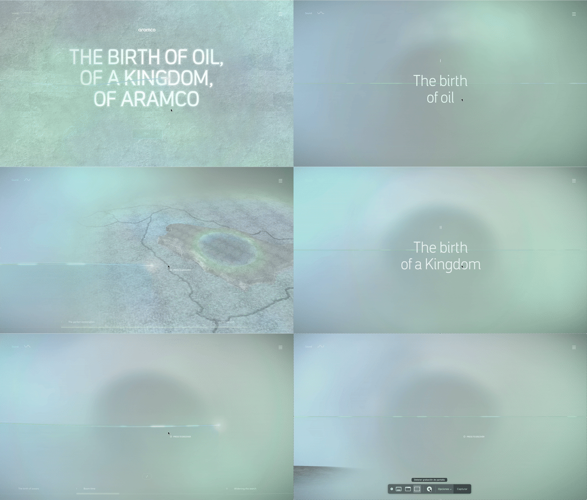
Aramco
While these proyectos do not usually stand out for their accessibility—as they are somewhat complex and 100% focused on standing out—we can observe a great effort to generate a visual impact on the desired user.
But, importantly, why would it be beneficial for a company to create a site like this if it doesn’t generate something? That is where we might be wrong in stating that these sites do not generate conversions or attraction, because the opposite can happen. Winning a recognition like Site of the Day or Site of the Year from Awwwards can mean peaks in visibility and organic traffic. Many curious people will click to see the award-winning site, which can translate into a substantial increase in visits in the following days and weeks. For example, developers have observed that after appearing on the Awwwards homepage, traffic skyrocketed.
Indeed, the website ranks better and becomes easier to find thanks to the notoriety of the award. This “star appearance” effect may diminish in the short term (initial peaks), but it still leaves a mark. More people will know the brand/site, increasing long-term organic traffic through brand searches after hearing about the award-winning site.
In summary, winning a web design award is equivalent to an instant marketing campaign that attracts quality traffic almost immediately and strengthens future visibility. It’s like when a movie wins an Oscar; automatically everyone will want to see it for that very reason—because it’s the best. That’s why companies bet on this type of site despite the high cost, as it will generate:
Brand recognition and perception: Multiple studies from recent years reiterate that users judge a company’s credibility and quality largely by its digital presence. It is estimated that up to 75% of a site’s perceived credibility comes from its design (aesthetics, usability, professionalism).
Increased user dwell time: Recent studies confirm that multimedia elements and rich experiences capture attention for longer: 94% of first impressions are related to visual design, and users tend to spend 88% more time on a site that incorporates audiovisual elements.
SEO Improvement: Every time a site wins a major award, it typically gets a link from the award’s official website to the proyecto site. These links are usually dofollow and come from domains with high authority (for example, awwwards.com has high domain authority). According to experts, these backlinks are a real treasure for SEO, as Google interprets that your site is relevant and trustworthy when referenced by a recognized source.
These sites are also often used for storytelling, and for a few years now, we have seen how they integrate with VR/AR to make the experience as immersive as possible. A good example is Active Theory, which created a museum for the 20th anniversary of XBOX; although it is no longer active, we can see it in their case study on Awwwards.
Websites of this type are highly recommended when companies launch novel experiences (microsites, interactive campaigns) backed by analytics and feedback. That is why we usually associate these types of websites with being more commemorative, conceptual, or focused on something specific.
A good reference in this section is the people at MSCHF, who take these types of proyectos to a next level where they no longer seek to impress a user, but to conceptualize different ideas on a website. They take the conceptual to the purest side of the phrase: “How crazy can it be if we do this on a website?”. You only have to look at some of their proyectos: UPBLOB,MSCHFNOTWHEELSor THEFEEMOVIE.I could even say that some of them can cause a certain discomfort when navigating, but that is often what conceptual proyectos are about: bringing new ideas and seeing how they end up looking in execution.
Now we come to the somewhat more basic websites, which tend to be the ones that generate the most conversions and could be said to have the best cost-benefit ratio for a campaign.
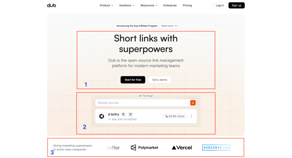
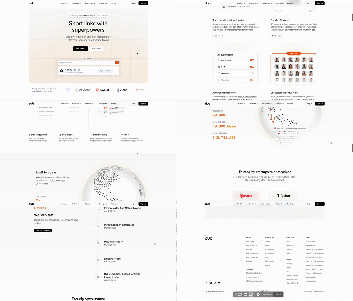
Taking the Dub website as an example, we can observe three blocks that catch the eye as soon as you enter the site:
The first block clearly and quickly indicates what the product does: “Short links with superpowers,” accompanied by a second text to provide better context. We also see that we have two CTAs to indicate to the user that they can start for free now or get a demo to test all the product’s features.
The second block gives us a quick test of the product’s main functionality—shortening links—without the need to register. This allows the user to immediately experience its utility and understand its value proposition, thus generating a positive first interaction that conveys trust and leaves a favorable impression of the product.
Finally, a block is presented to reinforce the product’s credibility by showing that it is already used by multiple clients. This social proof conveys trust to the user by evidencing that it is a solution tested and valued by others.
As we can observe, the structure of these sites is usually simple—even limiting the number of transitions or animations—but functional, accompanied by a modern and creative design where the user experience is prioritized in every section:
Ensuring the user understands the product 100%
Simple navigation accompanied by various demonstrative blocks
Achieving a visual impact on the user
Maximizing conversions and audience retention
One of the reasons these sites are used more than the previous two is their high acceptance by users and their great features that help boost metrics. These sites usually follow “design patterns,” making the experience feel familiar to users and greatly facilitating navigation.
40+ UX Statistics (from 150,000 hours of UX Research) by Baymard
Like this graph, there are thousands more that demonstrate that design applied intelligently and oriented toward the user generates not only conversions but also attraction, retention, and acceptance by users.
Thus, we can conclude how beneficial it is to have a modern website today, where the best design and user experience practices are applied. Above all, when we are looking for an entry point for the user, the goal is for all relevant information to be clearly available and easily accessible. That is why this type of approach is common in corporate sites or product pages where the desire is to present all services and make it easy for the user to find what they need without effort.
One of the questions you might be asking yourself is “and how much does it cost to do something like this?”. And naturally, we can say “too much.” But it’s not just about the financial aspect, but also the planning and execution of the proyecto; therefore, we are going to focus this answer based on duration and investment.
Duration
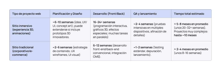
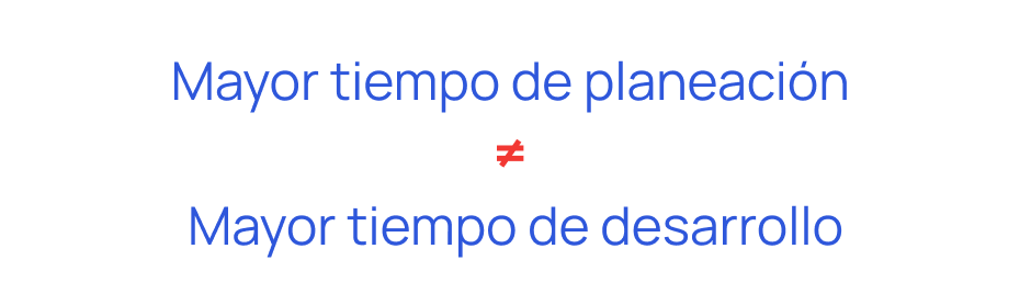
When we talk about timelines for these types of websites, we must understand that they are relative to each client and proyecto. Each case presents particularities that may require more time in the planning phase or the development phase. It is important to clarify that a longer planning time does not necessarily imply a longer development time. In fact, one can invest significantly in planning and still have a technically simple development, but with a high-impact result.
In the following table, we see how the difference in planning times between traditional and immersive sites exceeds 60%. While immersive sites can take up to a year to reach launch, traditional sites could be ready in approximately two months.
Investment
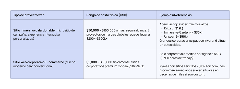
Knowing how long it can take to carry out these proyectos, we still need to put a price on them. In general, creating an immersive website with the quality to win awards is not cheap. It usually involves an investment that starts in the tens of thousands of dollars. Yes, we are talking about the famous five figures. And if the proyecto is more ambitious, for a major brand or with innovative technology, the budget can scale into the hundreds of thousands.
To put it in perspective, an independent designer mentioned that his own portfolio would have cost him about $25,000 USD if he had charged for it as a proyecto. We are talking about 150 hours of design ($15K) and development ($10K). And that is just for a personal site with limited reach. Imagine what it involves to build something similar but commercial, with a full team… The cost multiplies easily.
To give an example, let’s talk about AKQA, one of the big leagues in digital experience, with thousands of employees and proyectos for brands like Nike, Audi, or Coca-Cola. Their sites are usually part of huge campaigns with budgets that are not small. Although some directories show they start from $10k, in practice, an immersive site with AKQA can cost hundreds of thousands of dollars. The reason? Their scale, their comprehensive approach, and their high standards. It is not a reference for an “average site,” but it is worth having on the radar as an example of the top-tier agencies.
To close this section, we can conclude that:
These types of proyectos can even reach 6 figures.
Their planning is custom-made month by month due to the demand it represents.
All parties involved must be in total harmony.
These kinds of proyectos are usually very well diagnosed and planned from the start. Poor planning can lead to disaster in any field, which is why the direction to be taken and how to execute it must be very clear. This is something we could see in the “Call from Santa Claus (2014)” campaign, where planning could have taken months due to all the logistical implications (recording all the names, making the calls, etc.), but the development was as simple as a data collection form.
Conclusions
Not to go on any further, because there is much to talk about on this topic when it comes to website conversions, we can reach the following conclusions:
Evidence suggests that creative and conceptual websites provide significant measurable benefits.
In reality, the choice is not about pitting the creative against the traditional, but about finding a way to combine the best of both approaches.
An ideal site is one that not only looks good but also meets business objectives.
The duration and investment in more immersive proyectos is something to take into account for the campaign launch.
In an increasingly saturated digital environment, brands that bet on a creative website with the potential to receive recognition can obtain concrete benefits such as a higher conversion rate and prominent positioning, provided that the user experience is prioritized and aligned with business objectives.
And thanks to all this, we see how campaigns are boosted when accompanied by a good website, well-thought-out and, above all, well-designed.
I’m sharing some websites that will make you ask yourself: Is this really a website? 👽
And to close for good, ask yourself the following questions: Do you want to generate a “WOW” effect? Do you want your website to stand out? Do you feel your website is not modern? If the answer to any of these questions is ‘yes’, do not hesitate to contact us and we will guide you through the entire process.
How a website can boost a campaign
Category
Add your header text here
Company size
Add your header text here
Sector
Add your header text here
Proyecto
Lorem ipsum dolor sit amet, consectetur adipiscing elit. Ut elit tellus, luctus nec ullamcorper mattis, pulvinar dapibus leo.

 Screenshot of the yeezy.com website